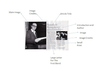
Double Page spread article features and connotations
Language
The theme color of black and white is used through out this double page spread, there is a lot of text therefore showing that the level of intelligence of someone reading must this must be high, this is also a convention so it is to be expected from this magazine. There is a main image on the left page with photo credits this is always the case with any music magazine and there genre. there is a large letter starting off the article this is to show class and keep in the old time like theme representing classical music. The text is also very small, leading to the re enforcement of the level of intelligence expected from the reader found in the target audience.
Ideology
The black and white color theme allows us as a reader keep interested as you are in the mood and the denotation wants that from the reader. The use of only two pictures means that the magazine is not for the people that read Karrang as there target audience is for teenagers they will have a lot of pictures and little text when compared to the classical genre in magazines
Representation
This represents fans of the article topic as well as the reader in general it shows that they are a person of the arts ad therefore are stereotyped to have a high level of intelligence. I also represents the people in the who print is the institution, they get judge on everything that is on the page so the quality must be there.

No comments:
Post a Comment